

Paper cards are polite. Metal cards are memorable.
And if you’re going to spend the money to go metal, you don’t want a shiny novelty that gets shown to one colleague and then exiled to a desk drawer. You want “I’m keeping this” energy. That comes from a few very specific design decisions that most people skip because they’re busy obsessing over the logo.
Hot take: If it doesn’t feel good in the hand, the design doesn’t matter.
A metal card can look incredible in a mockup and still fail in real life. I’ve seen gorgeous mirror-finish cards turn into slippery, fingerprinty little headaches. People handle them like evidence.
The keeper-cards, like those from Metal Kards, have three traits: satisfying weight, readable information, and a finish that makes your thumb want to linger (yes, that’s a real thing).
One-line truth: tactile beats visual when the medium is metal.
Why metal cards stick around (and paper doesn’t)
The psychology here is embarrassingly simple. Humans assign value based on physical cues. A heavier object signals “cost” and “commitment,” and our brains translate that into credibility. Metal also cheats time: it doesn’t bend, fray, or look tired after a week in a wallet, so it keeps broadcasting “premium” long after the handoff.
There’s a behavioral angle too. A metal card is a conversation starter, and conversation creates memory. People may forget your tagline, but they’ll remember the moment they went, “Oh wow, this is metal.”
A real data point, since everyone likes receipts: heavier products are consistently perceived as higher quality and more important in consumer perception studies. One widely cited experiment showed that added weight increased perceived seriousness and importance of information (Jostmann, Lakens, & Schubert, 2009, Psychological Science).
Materials + weight: don’t wing it
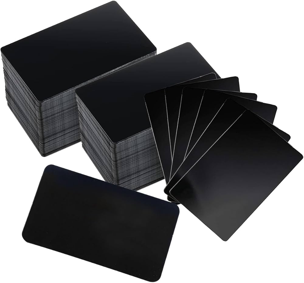
Now, this won’t apply to everyone, but if your brand leans premium and you show up with a thin aluminum card that feels like a fancy soda can… it’s working against you.
Material vibes, in plain language
– Stainless steel: modern, durable, “engineered.” Great for minimalist brands and sharp typography.
– Brass: warmer, luxury-adjacent, more tactile character over time (it patinas, which some people love).
– Copper: bold, artisanal, slightly eccentric. Can look incredible, can also age fast.
– High-nickel alloys: crisp, bright, very “technical premium,” usually pricier.
Weight is where people get weird. They either go too light because it’s cheaper, or too heavy because they want to flex. Both can backfire. Too light feels disposable; too heavy feels like you’re compensating (and it’s annoying in a wallet).
Here’s the specialist advice: choose thickness and alloy based on how it will be carried, not just how it looks on a desk. Wallet carry, pocket carry, event badge holder, presentation box, those are different use cases.
And yes, eco-friendly options can be real, not performative: recyclable alloys, fewer coatings, documented sourcing. If sustainability is part of your brand promise, don’t hide it in a footnote. Build it into the material story.
Grip, finish, micro-details: the part most designers undercook
Look, metal is unforgiving. Every choice becomes physical.
A keeper-card usually has controlled friction. That doesn’t mean sandpaper. It means your finish helps handling instead of fighting it.
Finishes that tend to win (in my experience)
– Brushed or satin faces for fingerprint resistance and a “tool-like” confidence
– Matte back so it doesn’t skate out of someone’s hand mid-conversation
– Micro-etching for logos or patterns that reward closer inspection
– Chamfered edges so it feels intentional and doesn’t chew up wallets
Some cards do this beautifully: smooth planes for elegance, then tiny texture shifts where your fingers naturally land. That’s not accidental; it’s ergonomic design, even if nobody calls it that at a networking event.
Small detail that matters a lot: corner radius. Sharp corners look aggressive but catch fabric, scratch other cards, and get bent over time. Slightly rounded corners feel “finished,” and people notice the comfort even if they can’t articulate why.
Typography on metal: clarity or you lose
You don’t get credit for being clever if nobody can read it.
Metal surfaces reflect, textures interrupt strokes, and fancy engraving can turn thin type into a shimmering blur. So you design like someone will look at it for two seconds. Because they will.
A few practical rules (yes, rules):
– Go bold enough that the type survives glare and texture
– Keep letter spacing generous on small text
– Limit yourself to one or two typefaces
– Use hierarchy like you mean it: name and primary contact should be instantly findable
I’m opinionated here: ultra-thin minimalist fonts on metal are a rookie mistake. They photograph well. They perform poorly.
Also, don’t scatter information around the card like it’s a poster. Metal wants structure. Strong alignment grids. Clean blocks. Breathing room.
Layout hierarchy: stop treating the card like a miniature website
A metal card is not a brochure. It’s a trigger for the next action.
So your hierarchy should be ruthless:
- Name
- What you do (in human words)
- How to reach you quickly
- Secondary details only if they earn their space
That’s it. Anything else is just you trying to be thorough. Thorough doesn’t get kept; useful gets kept.
One-line paragraph for emphasis:
Make the scan effortless.
Value proposition + next step: the credibility engine
Here’s the thing: “Founder” and “Consultant” are not value propositions. They’re vague job vibes.
You need one concrete sentence that answers two questions:
– What outcome do you deliver?
– Why should they trust you?
Examples that actually work on a card because they’re specific:
– “We cut onboarding time by 30, 50% for B2B SaaS teams.”
– “Fractional CFO support for $5, 20M businesses preparing for funding.”
– “Brand identity systems that scale across packaging, web, and retail.”
Then you give them a next step that’s frictionless. Not five options. One.
You can do:
– A short URL to a case study page
– A QR code that opens a calendar link (only if it goes straight to scheduling, not a menu)
– An email that’s clearly monitored (not “info@” unless you’re serious about response time)
And yes, credibility can be tactile too: a subtle deboss around the CTA area, a recessed QR field that frames the action, a finish change that guides the thumb. That’s design doing sales work.
A quick reality check before you print 500 of these
Metal cards magnify mistakes. Bad kerning looks worse. Weak hierarchy becomes chaos. A cheap finish screams “promo item.”
If you can, prototype two or three variations and hand them to real people. Watch what they do. Do they flip it? Do they squint? Do they rub the surface? That feedback is gold (and it’s way cheaper than regret).
Because when it all clicks, weight, grip, contrast, promise, you don’t just hand someone contact info.
You hand them an object they’ll keep around long enough to remember you.